Election Maps
Of course, there are a ton of interesting maps showing the results of the election in different ways. Considering how many of my posts were on the election and how many are on maps, I'd be remiss without featuring some of them here. Sylvia Cabus (Hi, Sylvia!) pointed this one out for me:
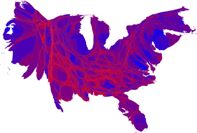 What this shows is the 2008 Presidential election results at the county level on a color scale ranging between blue (for the Democrat) and red (for the Republican), with the size scaled to the population of the county, and the shapes distorted to connect everything contiguously.What do we learn from this map? Well, at the most basic level, we learn that this notion of a "Blue America" and "Red America" is a vast simplification.
On the other hand, it's a little hard to tell what we're looking at here, because things are so distorted. One pattern you should be able to make out, though, is that there are a whole bunch of bluish discs (cities) surrounded by a matrix of thin red areas (rural counties). We can lose a lot of nuance but see this urban/rural split more clearly by looking at a non-distorted map with a straight red/blue split:
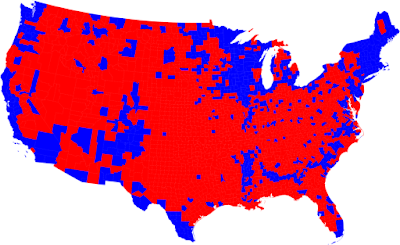 Here those thin bands of red between the blue shapes look like a vast red sea peppered with little blue islands (cities and college towns), framed by some more solid masses of blue in the Northeast, West Coast, and Upper Midwest. Obama won the cities, but there are also some significant rural areas that he won, too. Besides those mentioned above, there's also the heavily-African-American counties in the South along the lower Mississippi and then in a wide band from central Alabama up to North Carolina. There are the heavily-Mexican-American counties along the border. There's also a lot of Indian reservations and other areas with a lot of Native Americans in the Southwest and places like the Dakotas.
Kind of hard to spot, and mostly unremarked-upon, is the fact that a number of rural mountain resort areas also voted for Obama --- check out sparsely-populated Alpine and Mono Counties in California; Summit County, Utah (home of Park City); and a lot of the mountainous counties of Colorado, which are contiguous with both the urban Colorado counties and areas with a lot of Indians and Latinos.
To put it another way, the Republican base is white, rural America, with some exceptions. The suburbs are a battleground, and the Democrats have everything else.
But the same thing using the graduated color scale seen in the first map helps us see things a bit differently:
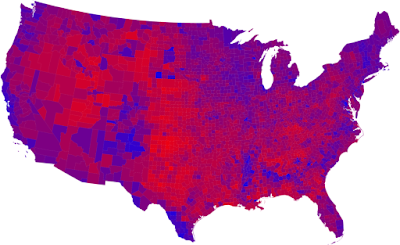 Here the states from Indiana to Pennsylvania look very purple; these places are pretty evenly split between Republican and Democratic voters. The Great Plains below the Dakotas range from mostly-red in their east to bright red within a couple hundred miles of the 100th parallel or so.
I got all of these maps from this great page by Mark Newman at the University of Michigan, where he has more maps, more analysis, and similar information on the 2004 election, so you can see where the extra votes came from.
Here's an alternative way of scaling things, with a straight red/blue split, but with the brightness tied to population:
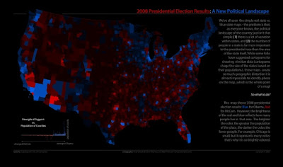 I like the concept here, but it needs some tweaking. First off, it's mostly just too dark; he needs to tweak his scale to something a bit more legible (maybe a white background). Also, because large counties with more population are displayed both larger and brighter, in a sense we're double-counting them. A better method might be to scale to population density, which would eliminate this problem.
How about showing the size of the margin between the two candidates? The L.A. Times has a nice interactive site showing just that for California, as well as a bunch of other state election info here.
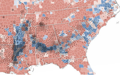
Remember that band of Democratic voters through the rural South? Strange Maps has a fascinating overlay showing the relationship between just that and a map showing cotton production in 1860. The correlation is very strong; this is where black people lived 150 years ago, and where they still live today:
And finally, not really related to the election, but an interesting test to see where the dividing line between the North and the South is, culturally, can be seen in this study of which McDonalds restaurants in Virginia have sweet tea available and which don't:
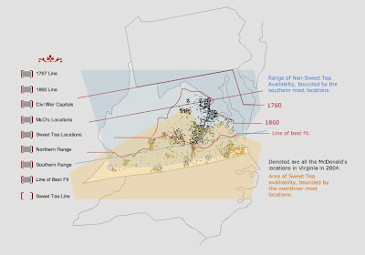 Ouch! It turns out that tea map is a fake. Neat idea, though.
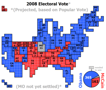
MORE (11/17/08): Wikipedia has a nice cartogram with the states sized according to their electoral votes and shaped in discrete blocks. I have no idea what their source was, but the map is pretty good:

0 Comments:
Post a Comment
<< Home